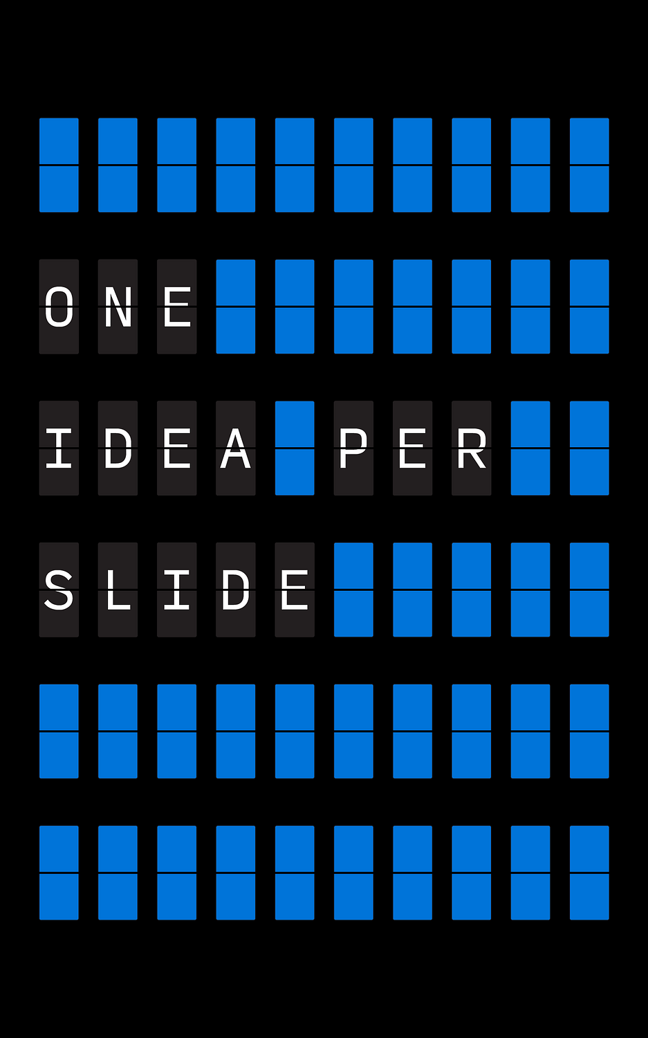
One Idea Per Slide
Cluttered slides littered with bullet points confuse people. Plus, they look like shit.
Think of each slide as a billboard. You're driving by fast. What's the one thing you should see?
Too much info on a slide overwhelms your audience. They stop listening to you; instead they're busy trying to read everything that smooshed into a 16:9 slide.
One idea per slide forces you to be clear. What's the main point? Put that front and center; everything else can wait.
This approach makes your message stick. People remember one clear idea better than a jumble of points.
Better to have 20 clear slides than 10 confusing ones. Your audience will thank you.
Simple slides look better too. Less clutter means more impact. Use big fonts and strong visuals.
This method helps you stay on track when presenting. Each slide is a clear talking point.
Don't worry about white space either. It gives the eye a rest and makes your one idea stand out.
If you need to show complex info, break it down. Use a series of slides to build up to the full picture and tell a easy-to-follow story.
Remember, slides support your talk. They're not meant to be read like a document. Keep them simple and expand and add context and color to the topic.
One idea per slide makes your presentations clearer, more memorable, and more effective. It's a small change with big results.
